Saturday, September 24, 2011

"Simply the best thank god"

September 2011 - many things changed!! A year of hard work finished!! I finished my degree, submitted my thesis, I did a month voluntary work in Naples, I met a lot of interesting people, found a job in a design company and a lot more.

Thesis submitted... finally!
The voluntary work in Naples was an experience that is difficult to explain. It was nice working with the kids but even being part of the group of volunteers was amazing. I appreciate more the simple life; we spent a month with the least possible technological devices and with no internet. With this we spent more time with each other, as a group. The experience with the children made me think on various aspects of life, and on how small things can be appreciated and make one happy.

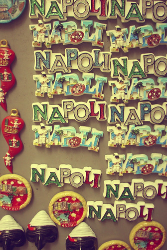
Fil-kunventNapoli Napoli Napoli

Pavement

Before leaving for Naples, I wanted to pause the end of the characterful vintage Maltese buses (2nd of July 2011). I went to Valletta and took many photos of the orange buses that I always remember in Malta. I also found this great article about the Maltese buses written by Jake Wallis Simons for BBC.
 

Part of his article: “No traditional Maltese bus would be complete without a collection of slogans hand-painted on the back.
"Forever young"
"Tracy Star"
"Speed of light"
"Chelsea Nigel"
"Travel magic"
"Life in heaven"
"Reliance"
"Babozz"
"Zunzan"
"Dominant"
"Get one free"
"Eat my dust"
"I wish you triple you wish for me"
"You're my own time lover"
"Living dreams"
"Simply the best thank god"
"Panorama elite 3"
And my personal favourite, "I don't care what people say - strong enough".” 
(Jake Wallis Simons, 2011)
 
These are some of the photos I took:

World Photography Day
The 19th of August is World Photography Day. The Malta Photographic Society organized a 2 day event for photographers and amateurs. These are some of the photos I took. More can be found on Facebook.

down down up

look uplook up

Wednesday, July 6, 2011

MCAST Flavours Exhibition – June 2011

Each year, at the end of the scholastic year, MCAST Art & Design organizes an exhibition with the work of the students. As the graphic design degree class, we took care of the branding of the exhibition, the adverts, the setup of our exhibits and documenting all the process each course was making regarding the exhibition. 
 
I was part of the brainstorming and proposed 3 ideas for the branding of the exhibition. Then when the branding was chosen, I was part of a group of 4 persons, which took care of documenting and taking photos of the overall process. It was a very busy and time-consuming task, because every week we had to go to each course and ask some of the students what were they doing, choose some of the presentations with their proposals for the exhibition, take photos and talk to tutors. Finally, we did a digital booklet.


The MCAST Art & Design Flavours Exhibition - Logo chosen (designed by 3 Degree Students) & the labels for the courses offered
The exhibition was held in the institute premises for the first time, so a lot of work was also needed in the institute. Each class had to prepare the room assigned, meaning also work like plastering the walls and painting them.
 
But all this was worth it! The work presented was very impressive and one could see the effort done by the students and the whole institute. The opening night couldn’t be better! I took more photos of the opening night and of the events of the night, such as, the fashion show and the graphics display projection.
 
Below are some images that show the progress and the final exhibits. On Facebook I also uploaded Album 1 & Album 2.


This is the Graphics Display Projection, ‘Tempus Fugit’ by Paul Camilleri, a great lecturer at MCAST.
 

I also updated my Behance Portfolio with my degree work, which was also exhibited at the exhibition.

Sunday, June 12, 2011

B.U through fashion

So, finally, I need to hand-in my thesis by 17th June. My thesis is on advertising, teens and self-esteem.


Different experiments were tried before the final project, such as, an interactive process magazine where one could see a person changing, starting from spontaneous photography to poses and photoshopped images. Before this experiment 5 stages for different photography styles used in advertising were determined, with the help of previous research and campaigns:
1. Spontaneous Photos – grab character, spontaneity, personality, hobbies
2. Aware of the camera but still herself – having fun and the character is still seen
3. Fake poses – character is diminishing and ambient is changing
4. Provocative – looks that try to grab attention and provocative poses – maybe with double meanings
5. Objectified – no more character
This experiment did not succeed because the process did not stand out and it seemed liked a normal photo-shoot.


Process Images - From spontaneous to posed photos

These experiments helped for the final idea.
For this thesis a company named ‘B.U through fashion’ was created and its teen awareness campaign magazine was named, ‘Closer'.


‘Closer‘ Magazine is an awareness campaign magazine aimed at teens. It is made of ‘real personalities, real girls, true fashion.' This study did not blame and did not focus on adverts as the cause of teenage problems, but focused on how to help teenagers believe more in themselves and it also emphasized on the importance of personality.


The idea was that of an online teen magazine made of spontaneous and candid photos of different women and teenagers. First, a photo of the person was taken without them noticing. Then, after showing them their photo, interviews about the photo taken and also about themselves, were carried out. This means that they created the magazine and that the photos used showed their personality with no poses, no retouching and nothing fake. This teen magazine aims to show different personalities and to help teenagers understand what means being you through fashion and through your own personality. Apart from the online magazine, the campaign also included posters, which used each participant in the magazine with the adjectives given.


The aim of this research project was to make a different awareness campaign to help teenagers be ‘models‘ with their personalities while having self-esteem and self-confidence subtly advertised. Questions like these led me to this project; How to raise awareness in order to show that one‘s personality can be given more importance than looks? How can I show everyone as he/she is, and threat him/her as a star, and most of all, let teenagers be who they really are? Finally, this campaign can be found on Facebook.

One can like the B.U through fashion page on facebook and find the link to the magazine and the campaign posters. A feedback survey can also be filled out.
CLOSER ONLINE MAGAZINE here


This project was also featured on Pavli Style website.

Saturday, June 11, 2011

Stencils & Spreads

After creating my font inspired from the Georgian alphabet, I designed the posters which can be seen in this post. Meanwhile I had done these experiments & stencils:


Stencils:

After this task I was given a random subject to search on and create 4 spreads following the same grid and inspired from the word given. The subject I searched on was 'Dirty', which could be interpreted in different ways. I had to take the photos to include in the spreads and choose the articles. After a lot of experiments, I presented these final spreads:


Aloaa Fragrance Pebbles

One of the modules of the previous semester was that of designing a beauty product (make-up or fragrance). I had the idea of designing an accessory range for different fragrances. 


In today’s hectic life and with everyone on the go, time is a constraint. The sense of smell plays a vital role in our sense of well-being and quality of life. Everyone feels the need to have a pleasant smell, mostly while interacting with others in everyday life.


My idea is that of having a fragrance carried with you without the need of spraying and that lasts more. I thought of solid perfume (like the ones we place in wardrobes) that can be bought in the form of a pebble. These can be found in a packet of 25 in a different fragrance, size and colour to match with different clothes. A pebble can be put in the accessories that can be bought with the fragrance or separate, like necklace, bracelet/bangle, watch and ring. These accessories can be made for both women and men. With time the pebble dissolves and releases the fragrance that is why you buy these in a packet of 25.


Icons

Detailed illustrations for the whole brand:


 Later I was selected to print the 3D model for the final exhibition. It was the first time that I created a 3D concept, apart from the module of the DStretch Group work. The first semester incorporated both 3D and Graphic Design, but the last semester is all focused on Graphic Design.

Thursday, April 7, 2011

Georgian Alphabet - Font Georgian Circular

In a previous post I had told you that I have been working on the Georgian alphabet. I had done research on it's form and history, did a presentation and to sum all the information up I had done the moodboard.
After this, my job was to choose about 10 letters, manipulate the shape, cut out stencils of the letters, and finally experiment with them for a typographic poster to promote the new font inspired from the Georgian alphabet.

So these are the chosen letters and how I've changed them:
These are some experiments I did for the poster:

Below are the final 2 posters; 1 is showing negative space and the other is more focused on the form:

This is how I presented the posters:
  
Details:


This was the first task of the assignment. Now I am working on editorial layouts and grids.